Pure Candles is a small Norwegian brand that offers handcrafted, air-purifying candles made from natural waxes, like beeswax. The client requested a visual identity and packaging design that communicated purity, sustainability, and a gentle sense of luxury.
The Challenge was to create a clean and elegant brand identity that reflected Pure Candles’ values: natural ingredients, air purification, and a mindful lifestyle. In addition, the brief also called for a thoughtful packaging design to match the brand’s tone and purpose.
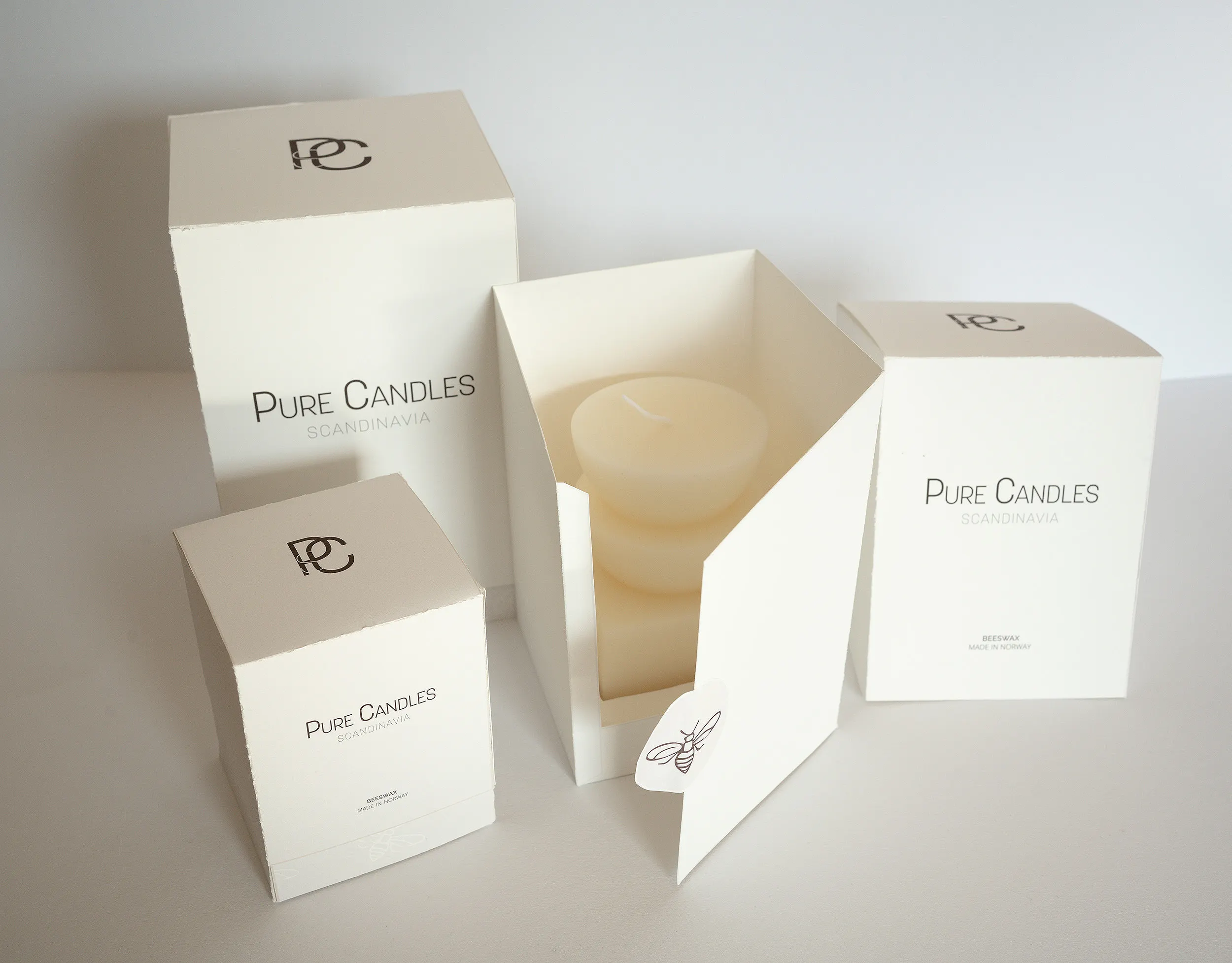
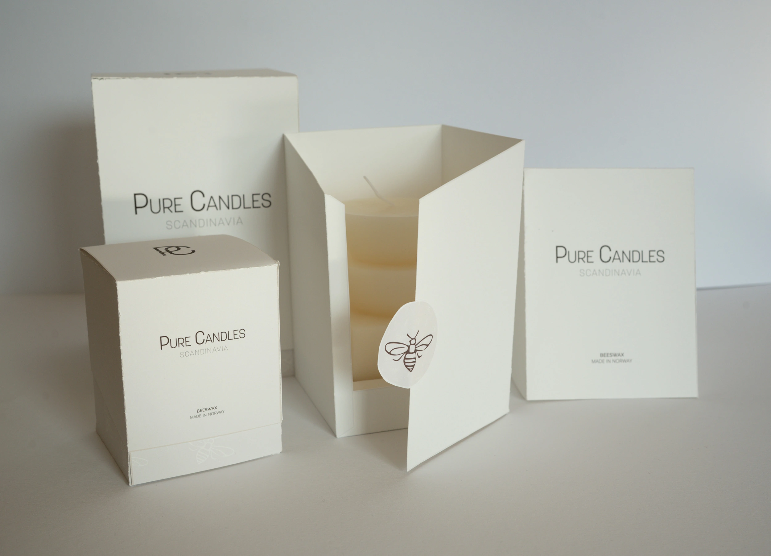
To reflect Pure Candles’ values of purity, calm, and care, the packaging system was designed to feel intentional from the inside out. More than just a protective shell, the box offers a thoughtful and elevated unboxing experience.
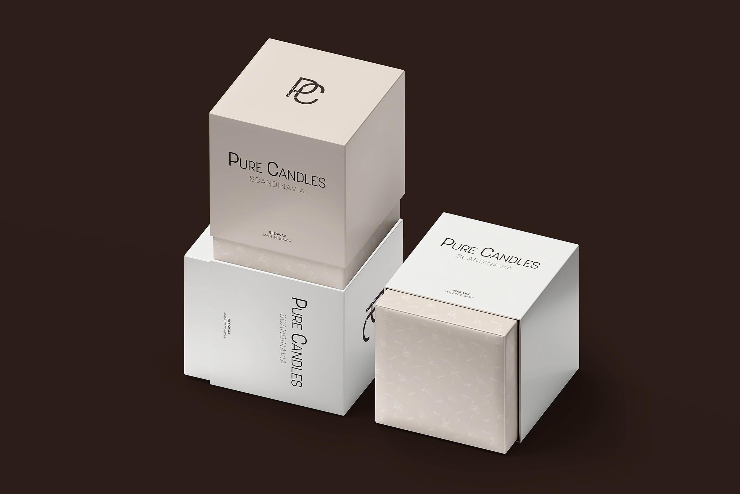
Each box is made up of three components:
Top Box: An outer shell that protects the product and sets the tone for a premium reveal.
Bottom Box: Holds the candle securely and introduces a unique flap mechanism that opens like a door.
Interior Support System: A custom two-part insert stabilises the candle inside, a lower base and an upper holder with a tailored cut-out to keep everything in place during transport.
The unboxing process is interactive and memorable. After removing the top box, the customer peels back a branded sticker and opens the flap to reveal the candle inside. This simple yet surprising gesture adds to the sense of care and quality. The packaging is designed to accommodate three different candle sizes, each following the same structural logic.
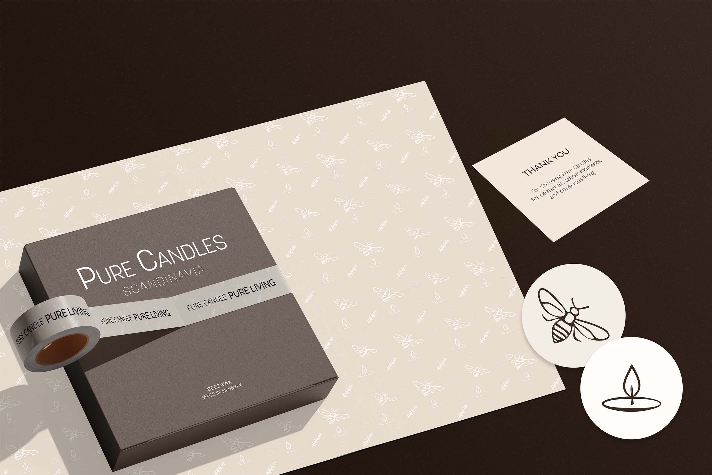
I began by exploring different visual directions that could reflect the purity and calmness of the brand. Once the tone was set, I developed the visual identity and applied it across key brand touchpoints, including packaging and digital presence.
A big part of the process involved building and testing the packaging structure. I designed custom dielines, printed prototypes, and assembled the boxes by hand to ensure that both function and aesthetics were aligned. To bring the brand into the digital space, I created a website prototype. Since the client didn’t provide product photography, I used AI-generated visuals to represent the candles, carefully prompting and editing them to match the visual style of the brand.
Here are real photographies of the prototype.