A soft, glowing butterfly animation used as a custom cursor.

Magnetic

Magnetic Magazine is an online publication specialising in music and culture. For this project, I designed the front cover and layout for four selected articles from their website. While the written content was sourced directly from Magnetic, I was responsible for all visual choices. This included selecting and editing images, establishing the layout style, and setting the overall tone of the design.

Cover of Magnetic Magazine featuring a high-energy concert scene with bright purple lighting and the title ‘MAGNETIC’ in bold, black uppercase text.

The Challenge

Magnetic wanted their online content in a print format with strong visual impact and long shelf-life. The magazine needed to appeal to an international audience and remain relevant across diverse music events globally. It had to feel fresh, bold and well structured, while still being easy to read.

Double-page spread with a full-bleed concert photo and diagonal white band reading ICELAND AIR WAVES EXCHANGE.
Magazine spread with text about Iceland Airwaves and images of performers and festival scenes, arranged in angular photo crops.
Article spread with FAQs about the Iceland Airwaves Exchange and images of different performers in bold lighting.

The Solution

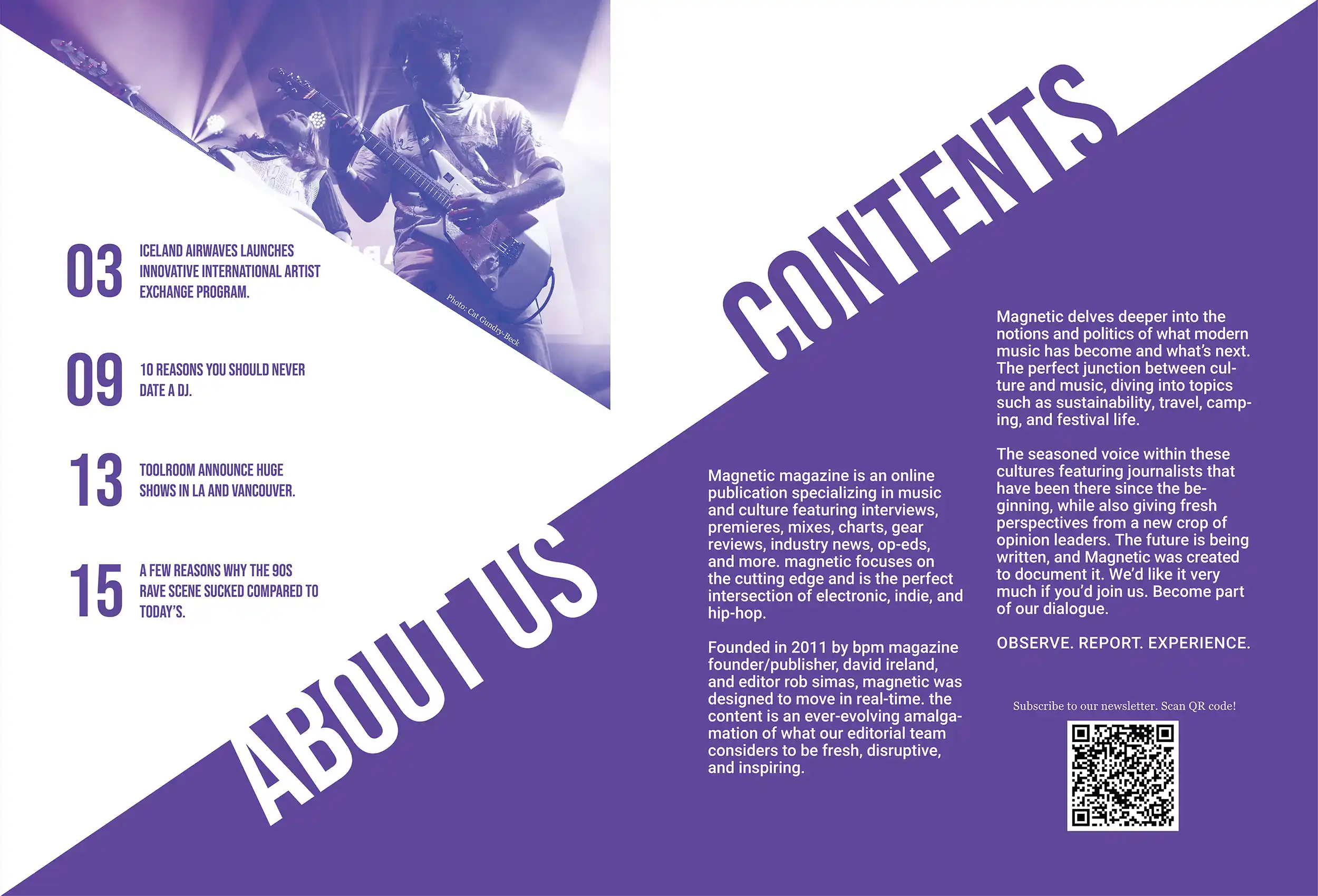
With a clear focus on layout and typography, I explored various editorial structures, testing different grid systems and experimenting with image placement and type hierarchy. The visual language is contemporary and dynamic, with the use of white space to balance the more intense imagery.

Cover of Magnetic Magazine featuring a large crowd at a concert under purple lighting. The layout includes a diagonal white stripe with the magazine’s logo and tagline “The Voice of Progressive Music Culture.
Double-page spread showing table of contents and about section. Purple background with bold diagonal white shapes, text describing Magnetic as a progressive music culture publication, and a QR code to subscribe.
Double-page spread with a full-bleed concert photo and diagonal white band reading ICELAND AIR WAVES EXCHANGE.
Double-page spread article on the Iceland Airwaves Exchange with photos of musicians performing. Text highlights the program’s partnership with the New Colossus Festival and plans for expansion.
Two-page spread discussing the impact of Iceland Airwaves and featuring quotes from key partners. Images include live music performances and diagonal design elements that frame the text.
Spread titled “10 Reasons You Should Never Date a DJ,” with a colourful laser light show on the left and a masked DJ performing on the right. Bold heading and a QR code encourage further reading.
Continues the “10 Reasons You Should Never Date a DJ,” article with a list format. The left page features a photo of a DJ and a close-up of people dancing with headphones under vibrant lighting.
Article about Toolroom’s upcoming LA and Vancouver shows. Includes performance photos and quotes, and a QR code linking to ticket information.
Spread featuring article titled “A Few Reasons Why the 90s Rave Scene Sucked Compared to Today’s.” Left page shows nostalgic rave imagery, while the right page lists satirical commentary on past rave culture.
Back cover of Magnetic Magazine with a solid black background, sharp diagonal white lines, and a centred QR code labeled “Contact Us.”

The Design Process

Since the text was provided by Magnetic, I focused my research on visual direction—looking into global music and lifestyle publications, especially those known for strong layout design. I studied the social media profiles of Magnetic’s audience and the Iceland Airwaves festival to get a sense of the community’s vibe, and chose photos that resonated with their energy.

I explored many visual compositions through sketching and testing in InDesign, adjusting grid layouts and experimenting with typographic contrasts. I wanted each spread to feel like part of the same world, while still giving each article a unique rhythm.

Other projects:

Pure Candles

ZestieZ

Esc it!

A minimalist lowercase “å” in black, paired with a small lavender circle beneath it. Representing the personal brand of graphic designer Ansaro Embalo.

Ansaro Embalo
Oslo, Norway.

design@ansaroembalo.com